Brand parody worked on this particular campaign because its grammar was so strict: a two-word imperative, a monochrome portrait, a wide margin and nothing else. Strip it to those rules and anyone can produce a convincing fake, which is what made the layout a template for a decade of image jokes about sanitary ware, office furniture and anything else the original would never have advertised.
There is a design lesson under the joke. A campaign reduced to a repeatable formula gains recognition and loses control: the more identifiable the frame, the easier it is to borrow, and the borrowed versions travel further than the media buy. This entry is kept as an archive record of one such borrowing; the author is not known.
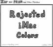 Rejected iMac colors
 Say hello to chiaMac
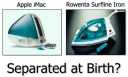 Seperated at birth?
 Say hellloooo to iMac
 Introducing.. the iBrator
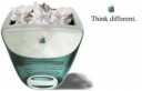 Think different
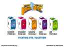 Mighty Morphin' Power Macs